By Ken Young, TNW
Netflix is bringing a significant front-end change to its interface today to create a consistent experience across all TVs like you have on game consoles, set top boxes, and Blu-ray players. The goal of this refresh is to bring the same level of enjoyment to par across all devices. This new cinematic experience rolls out today and will be available globally within the next two weeks.
Netflix
Viewing parity achieved
For many years, the world of television has been about sitting back and watching what’s on the digital screen. Netflix thinks that there should be a way to change this perception and make it more engaging. Chris Jaffe, its Vice President of Product, tells us that the company’s goal is set on advancing “the state of on-demand television”.
Today’s new design was developed specifically for the big screen in your living room, bedroom, family room, or anywhere else you have a TV. Instead of having disparity of its interface among various devices (Roku, Boxee, Blu-ray players, etc.), Netflix decided to rethink everything so that the same experience would be seen on every device.
new look of Netflix
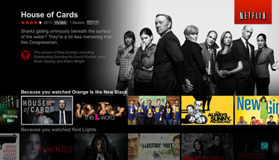
Jaffe tells us that the whole experience has been rebuilt to accommodate a “left, right, up, down” control system. What’s more, imagery throughout the entire service has been fully exploited to make you more involved in deciding what you want to watch.
One of the first things you will notice is that on Netflix’s home screen, the top half of the screen is your featured area. By default, it will pan through a series of shows and movies that are recommended for you based on past viewing history. The images displayed are either provided from the studio or a still clip from the movie or show.
Another new feature is the display of “notes” underneath the show’s description. These are hand-curated by Netflix’s team and a personalized selection is displayed for each user based on Netflix’s algorithm. For example, in the above image, the fact that House of Cards was the winner of three Emmys probably wouldn’t show up for everyone, but Netflix determined that it would appeal to this particular user.
In the bottom half of the screen, up to two rows of categories are displayed at a time. The thumbnails of the movies and shows are also no longer displayed in a portrait manner – they’re more landscape oriented. Instead of 10 thumbnails in a row, Netflix has added more choices, although no specific number was provided.
Read the full article by Ken Young from TNW.